I really like the WooThemes Canvas theme, and use it a lot. It is a plain, but sophisticated WordPress theme on which to build a more specific child theme.
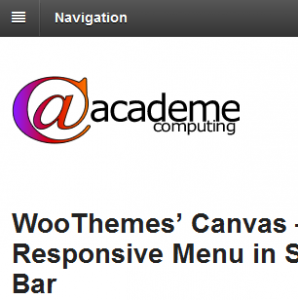
The theme uses a horizontal menu at the top of the page for the primary menu. When the view port is narrow, such as when displayed on a mobile device, the primary menu collapses to a hidden menu that is accessed through a “pillar box” button.
This page viewed on a wide screen:

Primary menu shown on wide viewports
The same page on a mobile:

Primary menu shown on narrow viewports.
Now that is great, so long as your design requires the primary menu to be a horizontal menu. Some sites put the primary menu in one of the side bars, down the left or right of the content. Canvas does not support collapsing those menus in a responsive way to the top of a narrow display port.
Luckily, there is a simple trick to work around this. Instead of just one primary menu, we use two: one horizontal and one in the side-bar. For wider viewport sizes we show just the side-bar menu. For narrower viewport sizes we show just the horizontal menu. The menu appears in the source of the page twice, but that’s not at all a problem as they are generally very light.
The first step is to create your menu. Create a custom menu in WordPress and give it all the menu items you want. That menu is then used in two places: within the Canvas theme it is set as the Primary menu, and within your side-bar is it set as a widget menu.
The primary menu for the theme is set, rather confusingly, in:
Appearance->Themes->Canvas (or child theme)->Customize->Navigation->Primary Menu (drop-down)
It is all done with some simple CSS. First to handle the horizontal primary menu:
/* Hide the primary navigation by default */
#wrapper #inner-wrapper #navigation {
    display: none !important;
}

/*
    This media query triggers for mobile devices,
    where Canvas puts the site into a single column.
*/
@media screen and ( max-width: 767px ) {
    /* Show the primary navigation (which shows responsively) */
    #wrapper #inner-wrapper #navigation {
        display: block !important;
    }
}
The width of 767px is the cut-off point at which the site displays as a single column. This is defined within the Canvas core stylesheets. It would be great not to have to use the !important directive, but since Canvas has it liberally sprinkled throughout its stylesheets, it must be used here to add enough precedence to override the core style selectors.
Next the size menu is hidden when the page is narrow. This is an optional stage – if you don’t hide the side menu, then it will just appear beneath the content, which is not a big issue, unless it results in too much extra scrolling to get at some important links below the main menu in the side-bar.
/*
    This media query triggers for mobile devices,
    where Canvas puts the site into a single column.
*/
@media screen and ( max-width: 767px ) {
    /* Hide the side-bar menu (which would appear under the content) */
    #nav_menu-2 {
       display: none;
    }
 }
In this example, I am using a standard WordPress menu widget, and it happens to be widget number two, so it gets the ID “nav_menu-2”. Your widget will likely have a different ID, so you will need to investigate in the page source. Do note, however, that this is the ID of the outermost wrapper around the menu. You do not want it to display as an empty box – you want the box hidden too.

Hey man, you’ve just saved me HOURS of work! This is one of those ridiculously simple things that you regret you haven’t thought of that first 🙂 Thanks!
Hi Jason,
The full menu is hidden for small screens. How do I make it display for mobiles as well?
Hi Stan, If I understand you correctly, this technique should work for mobiles too, as mobiles are quite literally just “small screens” when it comes to media queries.
Hello,
Please, do you know how to hide (or delete) all the mobile menu navigation on WooThemes’ Canvas ?
Thanks by advance 🙂